Case Study Design Systems & Enablement
A design system for an international nonprofit's online courses
Generation hired me to make their courses engaging, accessible, and easy to scale. The first two were design. The third was structure. So I walked years of their content, named the patterns nobody had, and built a system their team could keep building with. Five years on, they still are.

Context
Generation's courses ran on plain Canvas. No component library, no design structure, every page assembled by hand, using whatever the default editor allowed. There was a style guide document, and their team already knew it wasn't working. Overhauling it was listed as my first task.
What they asked for
A visual style guide. A set of copyable Canvas templates, one per page type. A run of basic design elements (logos, icons, banners, tables). And training for the curriculum team on graphic design principles.
What I delivered
- An audit of their existing course content, and a "needed components" list built from it
- Evaluation of Design Plus (CidiLabs) and the migration onto it
- A branded, accessible component system built on top of it
- Designs in Adobe XD, including a set of around twenty header banners, some country-specific and some generic
- The full front-end build, hand-coded in HTML/CSS/SASS
- Instructor enablement on both the tool and the system: video walkthroughs plus multiple live training sessions
- Ongoing support across five years, including a Claude skill for code-level edits
The full story: a visual project with a structural objective
Generation's welcome letter set out what they wanted: design that was "engaging, user-friendly, scalable and accessible to all learners." Mat, their Director of Online Learning at the time, put it almost identically when describing the project: "engaging visuals that are accessible to all learners and that can be easily scaled by our curriculum team."
Engaging, accessible, and easily scaled. Those were the guideposts that would direct nearly every decision on this project. They were also the three biggest problems with the course design at the time. Course to course and page to page, the graphics differed in style, color, and font. Many design elements were static images and not accessible at all.
Identifying that gave me a clear first step. Walk the current coursework, identify the repeated patterns and content types, and sort out what was important and what was not.
What I was actually looking at
Every page had been built by whoever needed it, sometimes with cobbled-together Canva graphics, mismatched icons, text as images. The same type of content appeared across courses in different shapes, not because anyone disagreed about how it should look, but because there was nothing shared to reach for.
Three examples, all from one course homepage:
The staff bios were images. Not styled text, but exported picture files, one per person, with the name, role and email baked into the pixels. Nobody could translate them for another cohort, search them, read them with a screen reader, or fix a typo without reopening the source file and re-exporting.
The section dividers were typed periods. A row of them under every heading, wrapping to a ragged second line at a different point on every page, because the row was typed by hand and the column widths differed.
The Zoom links were prefixed with >>,
typed by hand, because there was no consistent component to use.
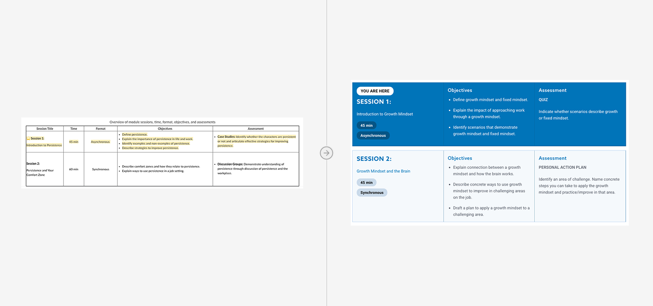
Every one of those is a structural problem that received a visual answer. A bio is content; it had been turned into a picture. A divider is structure; it had been drawn with punctuation.
It also wasn't anyone's fault. They did the best with what they had and solved their problem in the moment. There was no consistent thread or structure to cling to. They were given plain Canvas, a couple of references for how people had done it in the past, and a course to ship on Monday. My job was to create that thread of consistency. To build the scaffolding and framing that would make learning with Generation on Canvas a consistent and pleasant experience.
To begin, I walked through many, many courses and cataloged what I saw, with help from Carli, their LMS administrative specialist and the person I worked with most closely.
Naming what was already there
The result of that walkthrough was a list. Not a list of blocks, not yet. What they had was recurring content types: bios, calls to action, required reading lists, Zoom links, office hours. Each one appeared repeatedly across their courses, and many instances had been designed from scratch.
So the list named the content types first. Not all of them required blocks. Some could be combined and morphed, and one block could serve multiple content types. Our job was to identify the needs so we could plan the blocks. This was the start of the blueprint for the component library.
In addition to the blocks we identified, we added various standard smaller pieces: headlines, multi-column text boxes, centered buttons. Just in case they needed something a little outside of what the blocks provided.
Our initial plan was to create pages they could duplicate and edit. A great first step toward consistency across coursework. However, it became clear the layouts of various courses were so different that they needed something more dynamic. Something that could be pieced together and still be consistent and adhere to the structure we set.
The tool, and the layer above it
Carli brought Design Plus to the table in my first month and asked me to review it. It's a Canvas add-on from CidiLabs that supplies a mechanism for reusable content blocks. I had never heard of it.
So I evaluated it against what their scope had already taken for granted. The Canvas theme stylesheet worked; I confirmed I could pull in Google and Adobe fonts to hit Generation's brand rather than settling for Canvas defaults. That solved appearance. It didn't solve structure and accessibility.
A global stylesheet lays a blanket of styles over everything to make it look consistent, while every page still has to be assembled by hand, with minimal WYSIWYG tools. Design Plus was the piece that changed that, and working out exactly how it could work with our content list and existing stylesheet was the missing piece.
But the tool was never going to be the fix on its own. It's powerful and it ships with components, just not your components. Its blocks are generic by design, they carry no brand, and they cover the patterns common to any Canvas course. A step ahead of what we were using, but we needed our stylesheet and custom blocks to make the solution actually shine.
To get branded custom blocks, you have to hand code them. So every block we identified was designed in Adobe XD, hand-coded in responsive HTML and SASS, converted into a form Design Plus could serve, and then installed into Canvas following the tool's own documentation.
A block can look right in XD and in static HTML and CSS and still fall apart once a curriculum specialist pastes their real content into it. I'd designed the blocks around the content I saw in the audit, but people used them in ways I hadn't anticipated: far more content than a block was sized for, or an image dropped into a spot I hadn't planned for. A layout that looked clean with three lines broke at fifteen, or buckled around an image that was never supposed to be there.
Fixing it meant taking my assumptions out of the CSS. I stopped coding blocks for the content I'd seen and started coding them for the content I hadn't: relative spacing instead of fixed, layouts that flex as content grows, and room for an image whether or not one showed up. Build for the content you didn't plan for, not just the content in front of you. That shaped how I wrote every block after it.
Balancing flexibility and consistency
I built that system in two tiers.
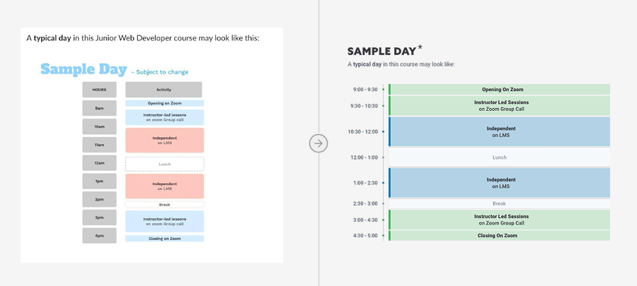
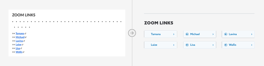
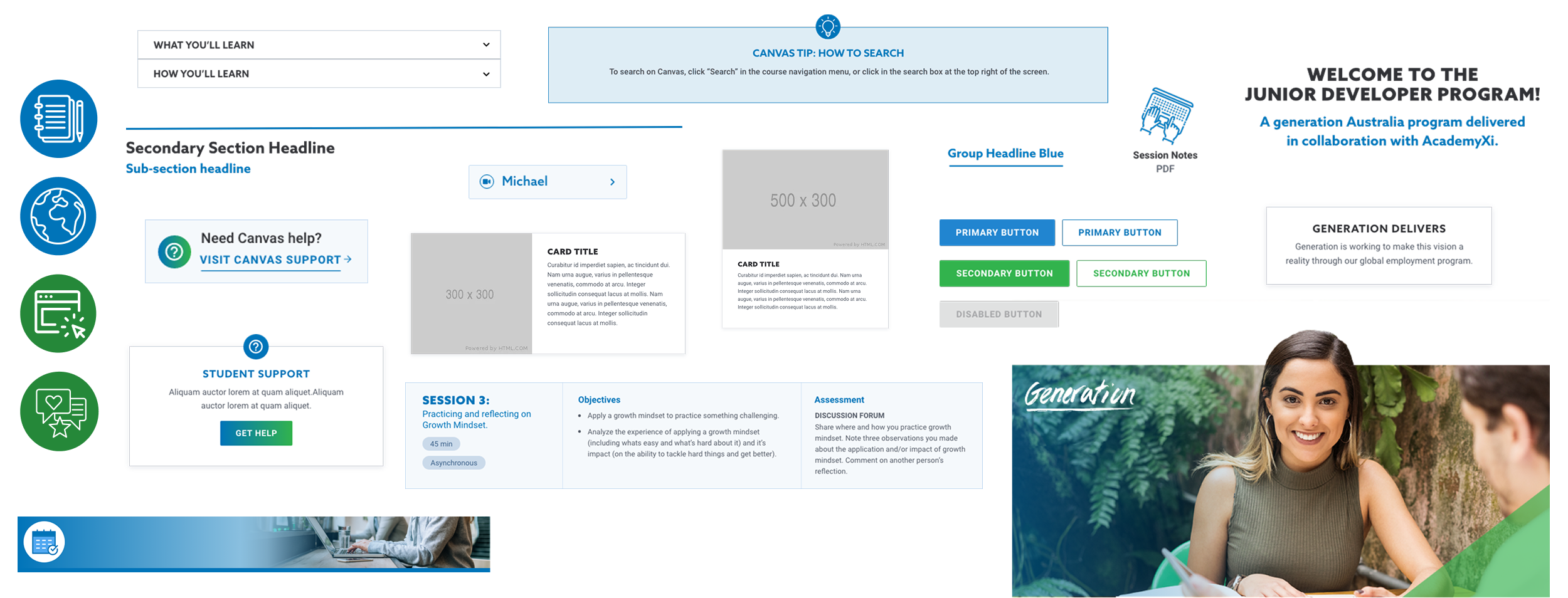
A small set of open-ended primitives handled generic needs: titles, body text, tables, tabs, accordions. Everything else was a purpose-built, named component for a specific recurring teaching pattern: a Stop block, a You Did It celebration, a Recommended Reading card, a Featured Video card, an Office Hours block.
The second tier is intentionally rigid. You cannot make a Recommended Reading card look like something else, and that is the point.
A completely locked down layout sacrifices content flexibility in exchange for consistency, and a completely open ended layout sacrifices consistency for flexibility. We were aiming somewhere on the tighter side of the middle. We wanted the consistency and structure to hold from course to course. But each course is different enough that the team needs to build as their content requires. The magic is in the middle. If we could nail that, we'd have a system that hit all three of our goals.
Five years of real use has pushed on that line in specific places. A curriculum team on a deadline reaches for the closest block to the job in front of them, which is exactly what they should do. Every time that happened, the answer wasn't to lock the system down harder. It was to widen the one spot reality kept pressing against.
Built in a loop with the person who'd own it
None of this was built and then handed over. Carli led Generation's Canvas curriculum team, and she was in the thick of it with me at every stage.
I pulled the content types from their courses, and Carli and I decided together which belonged in the system. Every block went design, review, code, review before it was real. From there it built up in order, from the homepage hub out to test courses, training, and the live sessions.
Everything ran through Ally, Canvas's accessibility checker, as we built, so we fixed things one block at a time, heading levels, link text, one stubborn session-block issue, instead of auditing a hundred pages at the end.
By launch, Carli had reviewed every block twice, tested all of them, and built real pages with the whole set. She wasn't handed a system. She had already helped make one, and she could answer questions about it because she'd been in the room for the decisions.
That's the part I'd repeat on every project like this, and it's the reason this one is still running successfully. A handoff is a moment, and moments are fragile. This was never handed off, because it was never only mine.
Training followed the design
After the blocks were designed, coded and in Design Plus, the last piece of the puzzle remained. Training the team to use the new tool and the new blocks.
Carli and I ran it together, and the split mattered. She set the agenda and led the overview, and walked everyone through the Canvas side. She was their colleague, and Canvas was their platform. I walked them through using Design Plus, a tool I'd spent countless hours in but had only taught myself months earlier.
So nobody sat through a contractor explaining their system. They watched their own team lead present something she'd helped bring to life. A contractor who trains a team and leaves creates a dependency on how good the training was. A team lead who co-built the thing and then helps teach it is a built-in resource showing you how something works. Five years later there is still someone inside Generation who knows why it's built the way it is, and that isn't because the videos and training docs were thorough. (Although they most certainly were.)
The bet we made at launch
About a month before we launched, CidiLabs announced that Design Plus was getting a new sidebar. It would be disruptive, and eventually the old one would stop being supported.
We were a month out. The team was trained, the courses were scheduled, and everything we'd built was built against the sidebar that existed. Rebuilding against something that hadn't shipped yet would have delayed the launch for a version nobody could test.
So we launched on the old sidebar and took the migration on as a known debt. Carli, Generation's leadership, and I made that call together, which mattered later. It was accepted deliberately rather than inherited by surprise.
Outcome
Plain Canvas became a branded, accessible, component-based system, localized for Generation's international cohorts, that their instructors were trained to build with directly.
The measure I care about is how little they've needed me. The build ended in March 2022, and 22 months passed before I heard from them. A global program, courses being built continuously, and no call.
What came back, when anything did, was never the courses. The curriculum team built those without me from the start. In 2024 it was a few new blocks and some bug fixes. In early 2025, more blocks and instructional videos. It was always code-level work, from a small CSS fix to a whole new block, the one part that still needed someone who could open the SCSS.
The debt comes due
In December 2025, we were reminded that support for the old Design Plus sidebar was ending on January 1, and Generation ran the transition themselves. They took the call with CidiLabs, had the new sidebar set up, and caught the problem in their own testing.
What they couldn't fix was the custom CSS. CidiLabs had changed the way their classes were formatted, so my stylesheet was pointing at names that no longer existed.
The fix was updating selectors. It stayed that small because the styling lived in one stylesheet aimed at components, rather than scattered across hundreds of hand-built pages. A deferred platform migration, taken on nearly four years earlier, came due as a set of class renames.
By then, that was the whole of what I still was to this project. Not the designer, not the trainer. The person who owned the CSS.
When AI entered the chat
The next round was mostly mobile. Blocks the team had reused in ways we hadn't planned, holding up on a desktop and falling over on a phone. Working through those, I noticed I was making the edits through Claude rather than by hand, so I built their team a skill to make them without me.
It's scoped to one job, fixing a CSS bug, and it encodes the same judgment as the rest of the system: edit the source and never the compiled CSS, keep specificity low, and stop and ask before any change that could ripple past one block. That caution isn't generic advice. It's the same discipline that kept the blocks robust in the first place, written down as a constraint for something else to follow.
Same idea as the component library, one layer down.
It's new, so I won't claim a result from it. Their team has started reaching for it instead of sending bugs to me, which is the right early signal. Whether it closes the last gap is the open question of this project.
Reflection
What I'm most proud of
How much easier and more engaging a course became to read and move through once everything came together. Structure and the right blocks made all the difference: the same content, finally legible and consistent instead of cobbled together page by page.
What I'd change
More mobile testing. Every block was coded responsive and I tested them that way, resizing a browser and checking breakpoints, which is not the same as testing in the Canvas mobile app. The app loads the custom stylesheet differently and picks up its own quirks from that, and I treated the one as covering the other. Tables were the clearest case. They are notoriously bad on phones to begin with, and the headers were where ours fell over, which is a layout problem and an accessibility problem at once. It took a long time to catch those bugs. It's all fixed and properly tested now, with a separate mobile stylesheet that loads conditionally.
Work Notes
Occasional write-ups on what I'm learning as I build.
-
September 2026
I was teaching designers to build websites. It turned out to be bigger than that.
Five years of mentoring career-changers taught me that coding is really just learning the dance of problem-solving.
Read the full article -
June 2026
Bringing my son's video game sketches to life with AI
My son has an amazing imagination. He also loves video games. Today we brought his own video game to life.
Read the full article -
May 2026
What Happens When Your Designer Has Never Used the Internet
My 8-year-old designed his own progress bar. It's so much better than what I was planning.
Read the full article