Case Study Product Design & Research
Reworking a trucking payments app around its users
BasicBlock's trucking payments app had grown cluttered and hard to move through, and the founder wanted it modernized and ready for what came next. Working from the existing codebase, I reworked it around what carriers actually need: reformatting the core screens to the data a trucker really scans for, adding a bottom nav for the things they reach for most, and validating it with real drivers. It's live now, rolling out to users. AI carried a lot of the build, with me conducting. (That story is its own piece, which I get to at the end.)
Context
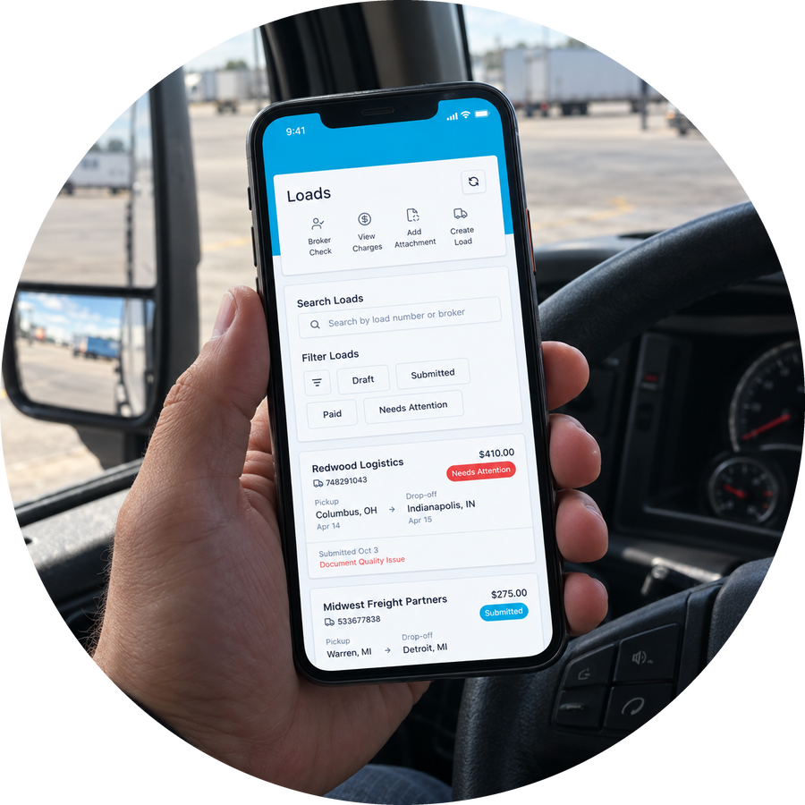
BasicBlock's app had grown the way startup apps do. The navigation had become a catch-all, heavily centered on loads, with new pages added over time without a larger structure to hold them. It was cluttered and slow to move through, and the founder wanted it modernized and ready to take on more. He brought me in to rework it.
What I delivered
- A rework built from the existing app, not a teardown: kept what worked, fixed what didn't fit how carriers actually work
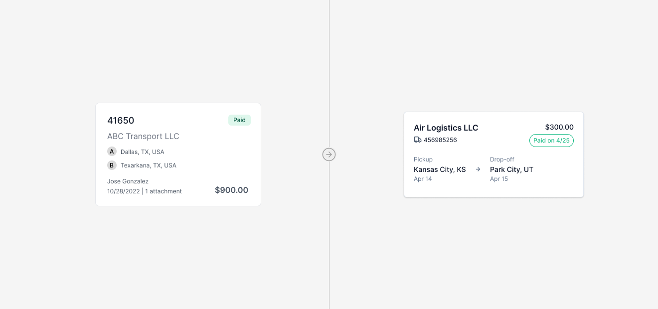
- Reformatted the core listing and detail screens around the data carriers care about (a load recognized by broker name and where it picks up and drops off, not the PO number they rarely use)
- A bottom nav that puts the app's main areas one tap away, with a plan to graduate to a fuller menu as more areas are added
- Moderated usability research across several rounds, including live testing with real drivers who had never seen the app
- The production rework itself, done screen by screen with AI carrying the code and me conducting, backend work ticketed to the engineers
- A launched app, now rolling out to users, modernized and ready for what's next
What I owned
The product design, the research, and the rework were mine to run. Specifically: reformatting the core screens around the data carriers actually use, the bottom-nav direction (worked out with the founder), the research, the evidence-based call to cut a nudge feature, and the production rework itself, done screen by screen with me holding every screen to the design. Chase, BasicBlock's PM, was a close partner throughout: he carries the deep knowledge of how BasicBlock's carriers actually work, which we leaned on constantly, and he weighed in on UI calls, co-ran testing, and helped run design QA. The engineers took the backend work, and the founder set product direction. I owned how it got designed and shipped.
The real problem: it didn't fit how carriers work
The app didn't need a teardown. Most of its structure was sound, and carriers are owner-operators running a business from the cab of a truck, so an app they rely on to get paid is not a place to surprise them. It needed to fit how they actually work, and two changes did most of that.
First, I reformatted the core listing and detail screens around the data a carrier actually scans for. The old screens led with the PO number, which carriers rarely use to identify loads. I led with the broker name and the pickup and drop-off locations, which is how a trucker actually recognizes a load. A small change on paper, a big difference in how fast the app reads.
Second, at the founder's push, I added a bottom nav that puts the app's main areas one tap away, so the things people reach for most are always in reach. A bottom nav has a ceiling, so we made the plan explicit: once there are more areas than it can hold, the app graduates to a fuller menu. Committing to the bottom nav now and naming its successor kept the app fast today without painting us into a corner later.
Testing it against real carriers
A redesign is a hypothesis until someone who isn't you tries to use it. We ran several rounds of moderated testing, about five to start, some I ran and some with Chase, BasicBlock's PM. They were rigorous: explicit success criteria per task, a think-aloud protocol, and a "we're testing the app, not you" framing. We ran the real workflows, happy paths and unhappy ones alike, from onboarding and document upload to requesting an advance, always asking the same thing: could a driver confidently self-serve without calling support?
We also got it in front of carriers who had never touched BasicBlock at all. Chase took an iPad to an industry conference and tested the app on the go with real drivers who had never seen it, which is the hardest and most honest audience there is: no context, no goodwill, just "does this make sense."
AI earned its keep in testing, too, as a tool, not a replacement. By the later rounds we weren't testing a Figma click-path but a real, coded prototype. That mattered: a Figma prototype walks everyone down the happy path, while a prototype that behaves like real software lets people go the wrong way, and what you learn then is true. As the PM put it, the old Figma version had felt like we were just guiding people to the answer.
When the evidence cut a feature
One idea we were genuinely unsure about was a way for carriers to poke or nudge a submitted load they hadn't heard back on, a release valve instead of calling in. The intent was good. The problem was that nobody, on our side or the carriers', could say what it actually did. Did it move you up a queue? Notify your rep? Promise a response? We reframed it into a testable "Nudge / Follow Up" feature and put it in front of carriers.
The testing confirmed the ambiguity. Carriers couldn't tell what it would do, or what to expect after using it, the same uncertainty we'd had internally. Across continued rounds it didn't earn its place, and it was cut. That call got made together, once the evidence was on the table. It's the cleanest example I have of what user research is actually for: letting evidence, not anyone's gut, decide what ships.
Building it
Validated designs still have to become working software, and this is where AI carried real weight for the first time on one of my projects. Working from the existing app code, we let AI take a first pass at the whole rework in more or less one shot. It did pretty well, further than I expected, and it did it in a few days. A from-scratch build would have gotten there too, and been perfectly good, but it would have taken months, so the speed was the real win. Still, "pretty well" isn't shippable. Steps were off, the UI drifted from the design in small ways, and the last stretch, the part where the design actually lives, still needed a person.
Conducting the build
So I became the conductor. I went screen by screen, AI writing the code while I judged every one: does this match the design, does it behave right, is this the correct pattern. That view-by-view walkthrough and polish is what actually brought it across the finish line. The styling lives directly in React Native style objects and our own component layer, so the rework fits the existing app instead of fighting it.
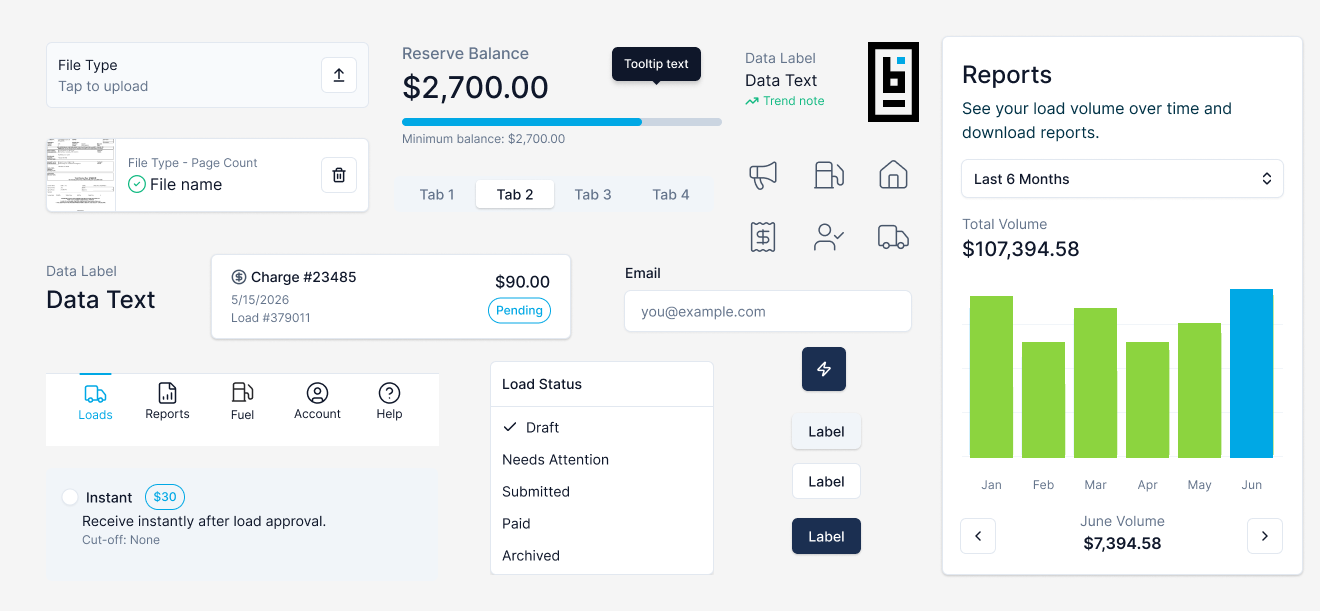
I was moving more of the design-to-code work into my own hands, so the design intent survived, while the engineers stayed focused on the work that actually needed their expertise.
Anything genuinely backend, or past where a designer should be making the call, I wrote up as a ticket and the engineers took it across the finish line. Chase ran design QA alongside me, weighing in on UI calls and catching bugs, with the carrier know-how to tell when something was subtly wrong for a real driver. The deeper story of how I build with AI, where it helps and where it falls down, is its own piece: "AI didn't replace the design work. It moved it."
Measuring it
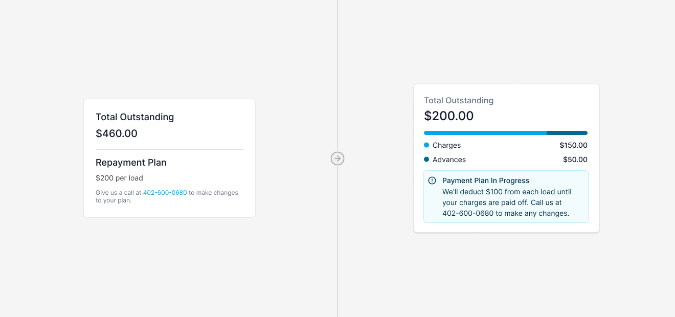
Design is easy to assert and hard to prove, so before launch I built a baseline. Chase and I inventoried the data we actually had, and I used AI to work out which datapoints were most useful and how to track them. Chief among them, the support calls that trace back to the old experience, the top one being carriers calling to ask when they'll get paid, which better in-app visibility should cut. The baseline numbers are captured in a doc, with a Claude task scheduled to pull the same cuts on a date down the road.
That is the measurement plan: a real before, a scheduled after, and targets set with the team. Building it to be measured, against targets set in advance, is the discipline most redesigns skip.
Outcome
The app launched in August 2026 and is rolling out to carriers, with roughly 500 on it as of mid-September. The product is live, and measurement is the deliberate next phase: the early signal is positive, and the real read on whether it moved the business comes from the baseline scorecard, pulled once the rollout has run.
What a rework can prove by launch, it did: carriers found it easy to use in testing, the research ruled out what didn't work as clearly as it confirmed what did, and BasicBlock came away with a modernized app it can actually grow on.
That readiness is what matters going forward. The app is set up to take on more without collapsing back into a catch-all, with a clear plan for how the navigation scales as it does. The goal was never a bigger app. It was one that stays legible as it grows.
Reflection
What I'm most proud of
The adaptation itself. This was the first project where AI took a real role and carried a genuine share of the weight, and it made the whole thing cleaner than it had any right to be. Once AI was in the process, it sped up immensely, and not just in the build. It carried as much weight in the design phase as in development. I ran a small team of specialized AIs on the Figma file: a copy bot keeping every string consistent, an auditor whose only job was making sure layers were named correctly, and others. It cut weeks off the timeline and brought a consistency to the file I'd normally spend a long, tedious time reaching by hand. It could crawl layers and pages faster than I could, and I could have several of them working the same file at once. The judgment stayed mine on every screen. The labor, and a lot of the consistency, came from AI.
What I'd change
I'd start with a coded prototype instead of a Figma one. We used Figma because AI hadn't blown up yet and it was the obvious choice, but it cost us, links between screens that didn't work and clunky flipping between prototypes in testing. Next time the prototype is real code from the start.
Work Notes
Occasional write-ups on what I'm learning as I build.
-
September 2026
I was teaching designers to build websites. It turned out to be bigger than that.
Five years of mentoring career-changers taught me that coding is really just learning the dance of problem-solving.
Read the full article -
June 2026
Bringing my son's video game sketches to life with AI
My son has an amazing imagination. He also loves video games. Today we brought his own video game to life.
Read the full article -
May 2026
What Happens When Your Designer Has Never Used the Internet
My 8-year-old designed his own progress bar. It's so much better than what I was planning.
Read the full article